Climate Visualizations
Here is a link to that amazing JPL global aerosol visualization we saw in class today. Pure awesomeness.
There are a lot of other great resources on the web that can help you understand climate. Going straight to the sources of data, such as the Tropical Rainfall Monitoring Mission (TRMM) site is a great way to find data. [Note: loop this animation and groove deeply on the annual cycle in precipitation--where is the ITCZ? The monsoons? Why is it raining over the Gulf Stream? Where isn't it raining?]
NASA has focused a lot of effort on explaining the earth system, and they have dynamite overviews of things like radiation balance, aerosols, biogeochemical cycles, etc., at their website:
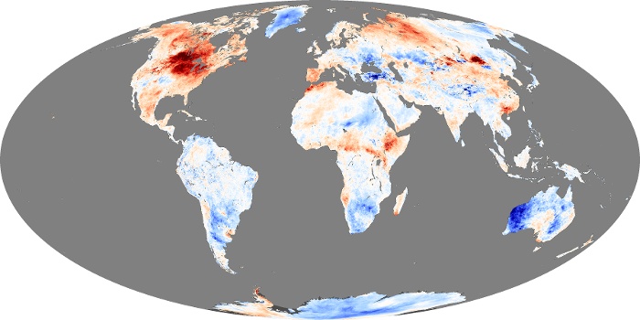
http://earthobservatory.nasa.gov/Features/ . (My lab had a hand in the Seeing the Forest for the Trees feature on forest carbon through our collaboration with Sassan Saatchi at JPL/CalTech.). Or, go straight to the good stuff by looking at the figures generated from remotely sensed data. These are excellent visualizations of most of the climate parameters that we have talked about in class.You can get lost in these figures, and there are some great animations as well.
posted by Miles Silman at 4:32 PM
0 comments
![]()
![]()
